


Let’s allow the firm to introduce themselves:
Herzog & de Meuron is an international architectural practice based in Basel, Switzerland. Since our founding in 1978, we have built a wide range of skills and experience that help us to customize solutions for every project. Over 500 highly engaged individuals from 50 countries are all eager to explore how architecture can meet the needs of our rapidly and radically changing world.
In the early 1990’s I called on this firm in Basel on behalf of an Italian Ceramic tile producer for a potential rain screen project. As it turned out, the project design was never completed, nor was the building built. But the stillborn project brought the firm to my attention.
Below are a few notable projects:
Tate Modern - London -2000 (Bankside Power Station)
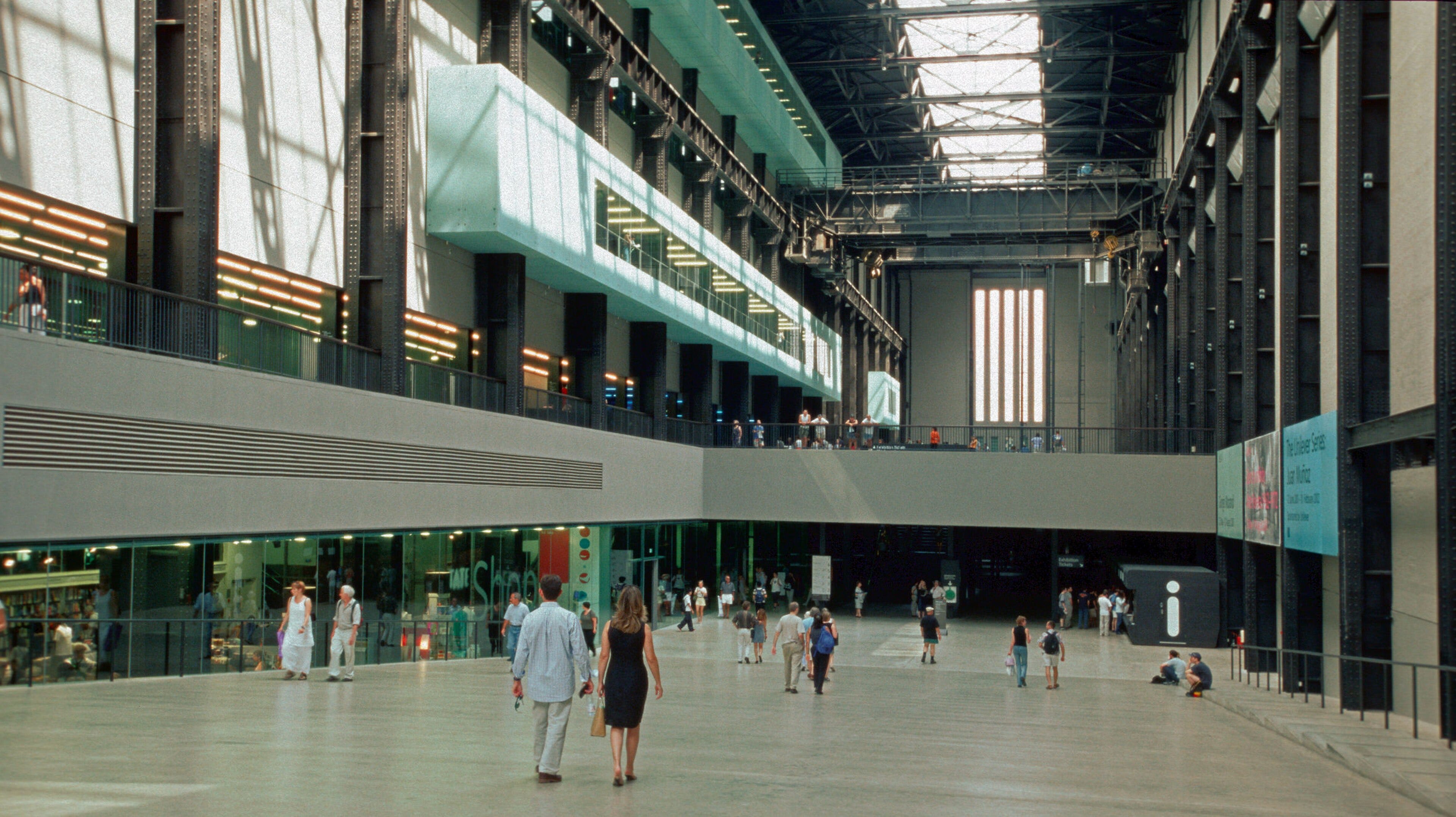
In 2000, the firm was tasked with repurposing the former Bankside Power Station. Imagine the intellectual effort required to transform a starkly industrial building into a space for one of the world’s most acclaimed museums.
The website https://www.royalacademy.org described the design process and result:
Eager to retain the imposing structural aspects of the building, their remarkable design created an expansive public space that’s become an emblematic part of the social, cultural, and architectural fabric of the city
Tate Modern - London -2005 (Blavatnik Building)
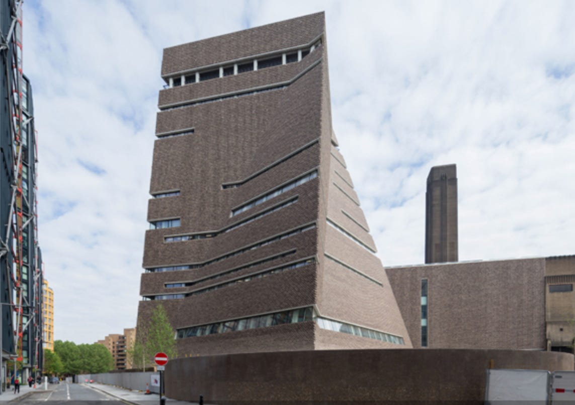
In 2005, Herzog & de Meuron returned to the Tate to design the Blavatnik Building (originally known as the Switch House) as an extension to their previous work.
Ascan Mergenthaler, Senior Partner at Herzog & de Meuron, describes the initial design process:
The design process started with the mission of the school when we were approached by the school to design the School of Government for them one thing was most important for them was really like to create a space for the people to meet and we soon talked about this idea of this forum space which is a mixture between circulation space and meeting space that we would bring this together in one central space forming the building and also being the heart of the old building and we like that idea a lot you know it kind of makes sense because if the students coming from all over the world and they they want to bump into each other they don’t want to sit just next to each other in the lecture theatre but they have the possibility to exchange and to meet into form two new groups developing ideas and things we related to this strongly and we even push it a bit further is that maybe the form space can even be used almost like a theater space or concept space.
Although most of my professional life in architectural products centered on tile, stone, and curtain wall systems, my reverence for brick never waned. This building shows the world the flexibility of brick in the right hands.
Laura Mark, writing in The Architects’ Journal, made this observation:
It is its high-quality finishes and the well-articulated detailing that really make the Blavatnik.
Elbphilharmonie (Elbe Philharmonic Hall) Hamburg 2017
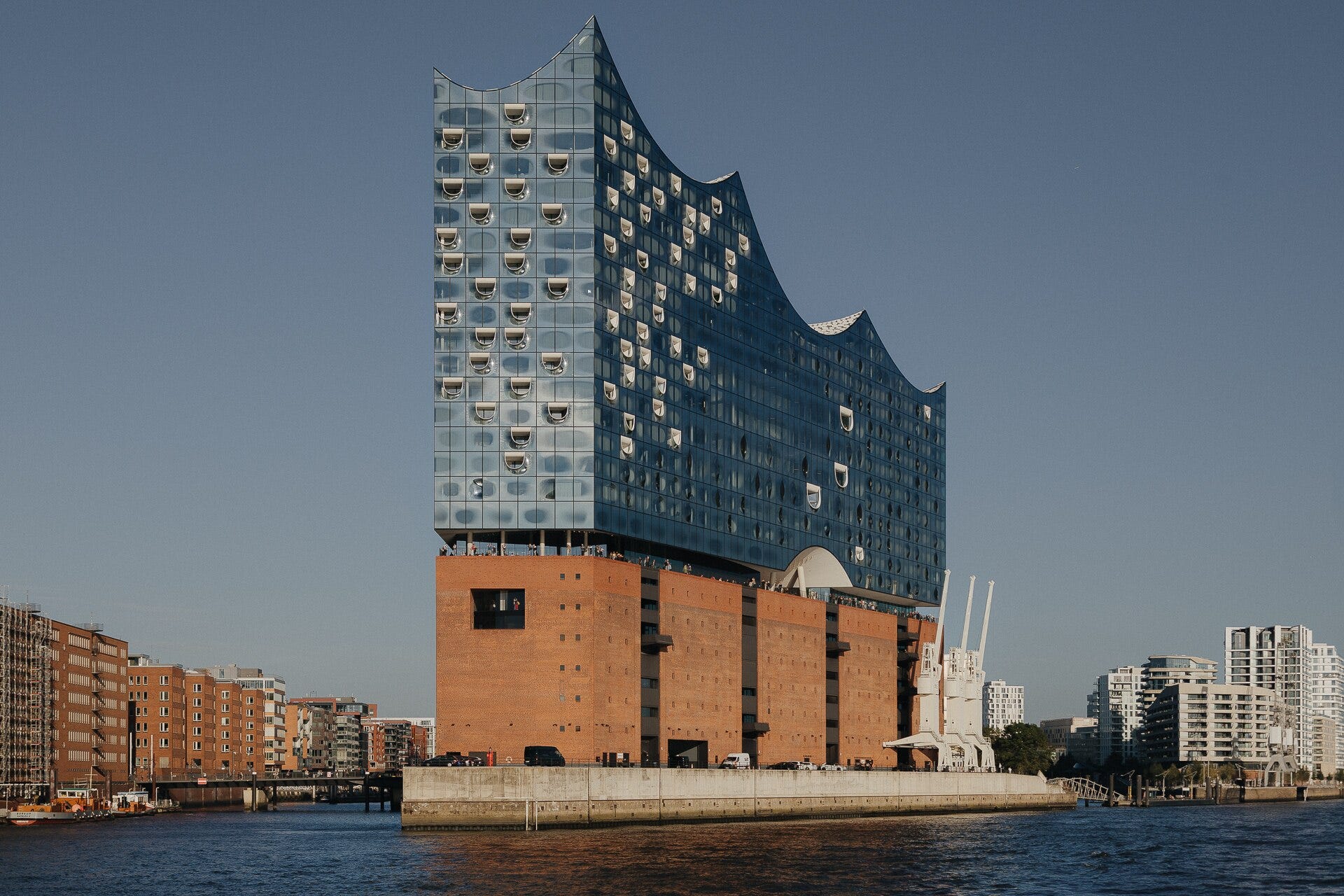
The Elbphilharmonie, located in Hamburg’s harbor district, represents an innovative approach to concert hall design. As an unreformed Modernist, my heartbeat still quickens at the prospect of a new glass-and-steel-designed high-rise. Yet Herzog & de Meuron’s decision to perch such a modernist form atop an existing brick warehouse suggests a compelling expansion of how Modernist principles can be creatively applied.
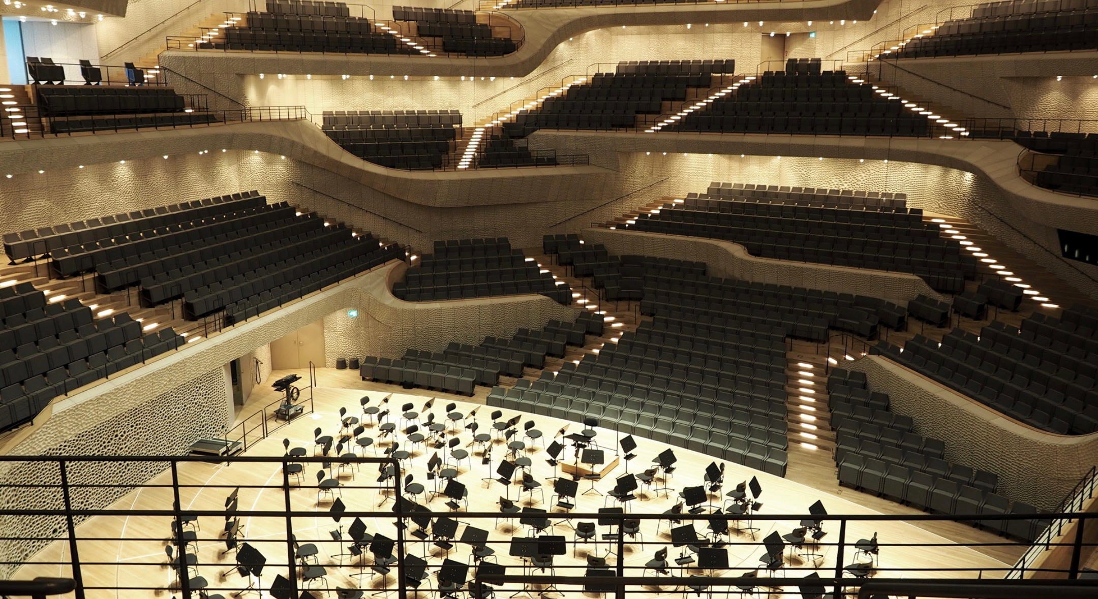
Architecture critic Rowan Moore opined below:
The Elbphilharmonie, to give it its proper name, offers a sequence of visual and architectural otherworldliness that starts with distant glimpses from the centre of the city and doesn’t stop when you reach your seat in one of its three auditoria, of 2,100, 550 and 150 seats. Its exterior, 110 metres high, is glassy and opalescent, curvy on top, above the brick block of the warehouse, a crystal on top of a rock, teetering because bigger than its base, but also lighter looking. Alternatively – and if metaphors are mixed it’s because the building provokes it – it is a cloud on a cliff, a sail, a wave, a ship, an iceberg, a tent. The main auditorium is both bubble and cave, its surfaces unified with a wrinkled, variegated, fascinatingly repellent surface that its architects call “white skin” but is really greyish and not-human, more pachydermic, dinosaurian or alien, or rather, as it’s hard, like moon rock.
The contrast between the modernist structure atop the brick warehouse certainly creates an interesting conversation piece. However, conversation pieces do not necessarily make good architecture. In this case, I would vote that the overall product of the design process is both attractive and functional
The Beijing National Stadium - The Bird’s Nest - 2008
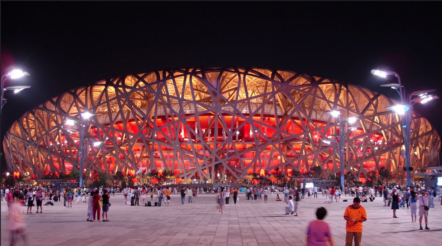
Beijing National Stadium is situated in the central part of Beijing’s Olympic Park. Herzog and de Meuron had prevailed in an international competition for the structure that would serve as the centerpiece for the opening and closing ceremonies of the 2008 Summer Olympic Games.
Polish art historian Anastazja Gibas observed:
From a distance, the stadium appears as a monumental, almost sculptural form with a soft, outline. Its structure is woven from densely interwoven steel beams that wrap around the mass like randomly arranged branches. This deliberate effect of irregularity evokes associations with the natural structure of a bird’s nest - and it was this visual metaphor that determined the object’s common name. The architects consciously integrated the superstructure, facade and roof into a single, inseparable whole.
56 Leonard Street, Manhattan
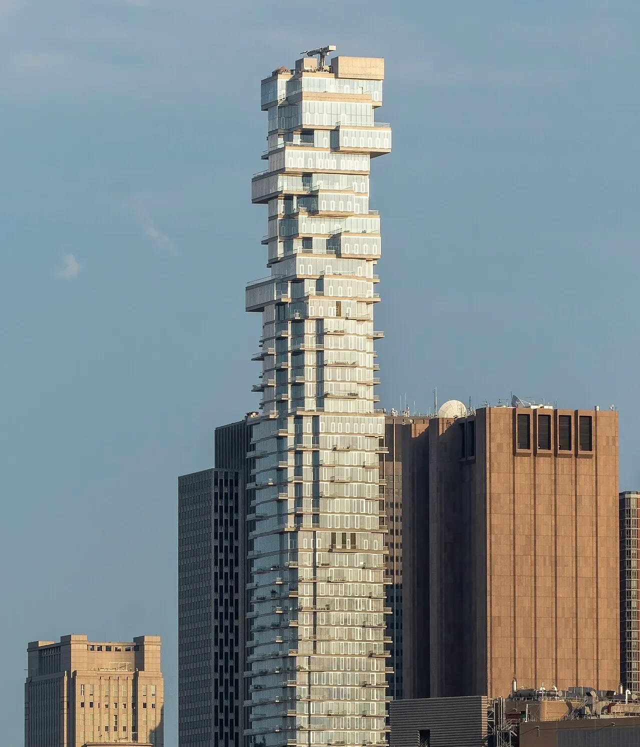
56 Leonard Street, in the Tribeca neighborhood of Manhattan, is a 57-story high-rise designed by Herzog & de Meuron and opened in 2017.
The architects had this to say about the structure:
The high-rise tower is an important ingredient within the contemporary city. However, towers have come to be defined solely by their height and, as a type, they have become anonymous. Typical residential towers, while successful in aggregating the living unit, often fail to improve upon the living environment.
The history of the Jenga Tower begins with the developer’s 2007 purchase of both the land and the air rights from New York Law School. Construction got off to a prompt start but was paused in the difficult financial times of 2008, before restarting in 2012.
Even the briefest of glances by a non-construction-savvy civilian leads to questions about the practicality of stacking asymmetrical cubes on top of each other. After all, the cantilevers formed by those overlaps are at the bottom of the building about 10 ft, but they extend to approximately 25 ft at the point where the glorious penthouses protrude into the sky above the city.
How did the engineers handle the various challenges presented by this project?
Cantilevers - Regarding the cantilevered areas on the lower floors, the slabs were simply designed to be thicker to carry the load. Further up the structure, where the cantilever length was greater, the design called for adding perimeter beams.
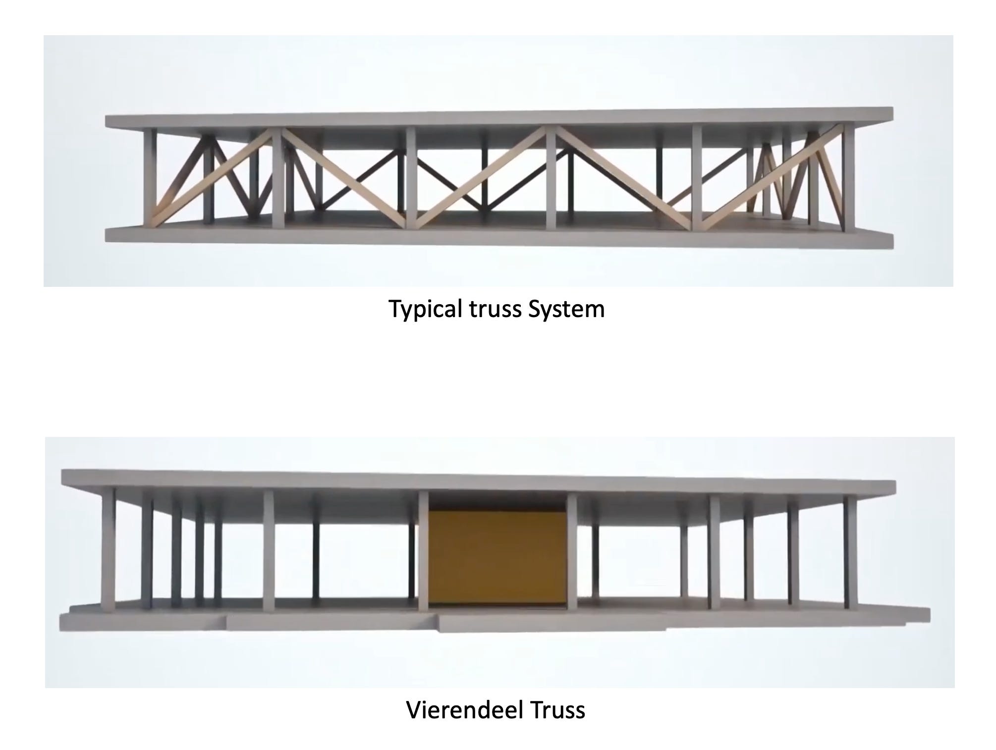
Moving even further up in the structure, where cantilever depths might reach 25 feet, the engineers used Vierendeel trusses to prevent obstruction of views. See second image below:
Building movement - at 56 stories, 56 Leonard Street is not one of the true supertall high-rises. Nevertheless, the irregular shape tends to increase wind management problems. The fear that the building might sway and vibrate a bit too much had to be addressed. The problem was solved by a liquid-tuned damper.
Project engineer Hezi Mena said:
Considering that the motion perceived by building occupants is linked to the peak acceleration at the top occupied floor, it was necessary to provide adequate strength and stiffness,” Mena said. To achieve this, a liquid-tuned damper (LTD) with a footprint of 32 by 36 feet, and a total height of 10 feet, was placed at the top of the building.
56 Leonard Street has been generally well received but seems still to be plagued by odd situations. For example,
Justin Davidson in New York Magazine said this prior to the building’s completion:
The 60-story condo tower, a year from completion and only three-fourths of the way to its 821-foot height, is already taking shape as the most alluring addition to the downtown skyline in decades.
However, the tower still seems to be plagued by odd situations. For example, a man who paid $28.5 million for his unit filed a lawsuit in March of 2018. He alleged in the complaint that his 14-foot ceilings, private elevator, breakfast bar, and motorized curtains were not delivered. This strikes me as odd. At what point did the buyer realize that the unit’s ceiling height would not be 14 feet? Or that there was no elevator going to his property? Or that the breakfast bar was AWOL?
In conclusion, is this work an architectural novelty or a further step towards a new way of understanding urban design?
Architect Michael Molinelli put it this way:
So while the Jenga Tower enters into everyday life in New York City, only time will tell us if it is an enduring design or just an odd diversion.
Conclusion:
Oliver Wainwright, writing in the Guardian as their architecture and design critic, said this about this Pritzker Award-winning firm:
Made famous…..for their startling transformation of the Bankside power station into Tate Modern at the turn of the millennium, they have gone on to build an unparalleled reputation for their ability to reinvent themselves for every single project, each building driven by an almost alchemical approach to materials, and an underlying interest in probing the weird and uncanny. Nothing they do is normal – especially when it comes to exhibitions.
A harsh assessment of the work of Herzog & de Meuron might be that their buildings demand attention like a show-off in the schoolyard. I prefer to see their work differently: as an effort to promote a positive view of architecture and its role in shaping the built environments where we live, work, and play.